Subsonic 6.0.beta2 released

Announcements and discussion of new releases.

Moderator: moderators

Re: Subsonic 6.0.beta2 released

Postby dirkal » Thu Mar 31, 2016 9:43 pm

I feel like I'm always the negative voice. But since (like many here) I've been dedicated to Subsonic since the beginning, I feel compelled to express my opinion.
While I appreciate an updated look, as well as the work that goes into creating it... This latest Beta has taken a drastic step backward regarding its usability. Or should I say "Flexibility".
I feel that this latest version is pushing us toward Microsoft's Metro-Style interface, in a take-it-or-leave-it sort of attitude.

The feature that put Subsonic far above the competition was that it was relatively flexible as to what the host was looking to feature and how he presented it.
There are so many uses for Subsonic. From a simplistic WinAmp-like music player, a full-fledged Media Center, a portal that can broaden the horizons of its visitors, or even as a media database to track inventory, I have personally utilized Subsonic for all of this. I miss the ability to list instead of drop-down. I love featuring various aspects of the software.

I suppose my question to Sindre is... "What is your goal?" Where does he want to take his product?
Personally, I'd love to see a ground up re-boot of Subsonic as a modular application that allows us all the opportunity to customize Subsonic in ways we hadn't previously imagined.
But that is asking alot for a "team" of programmers. But I would love to hear him share his vision, none-the-less.

I'm looking at v5.3 and v.6b2 side by side.
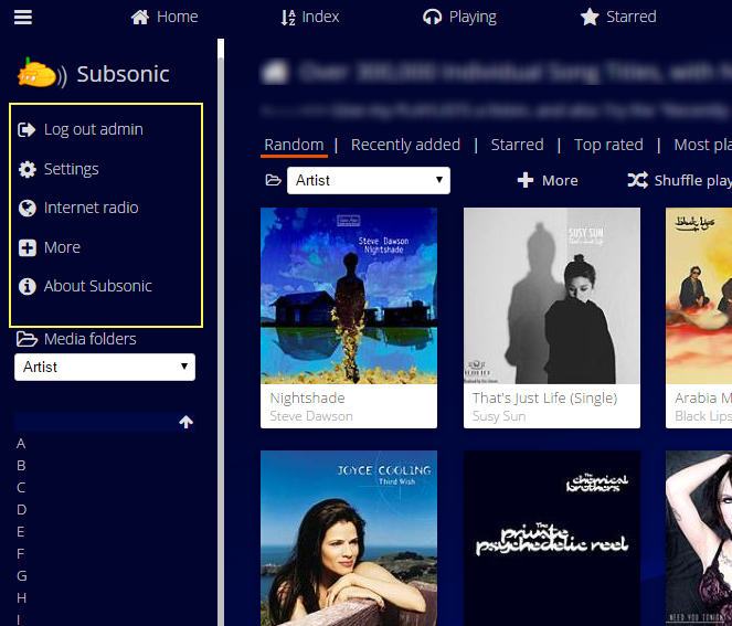
The area beneath the Subsonic logo in the left pane is prime real estate that is now populated by most things that the average user could care less about.
"Logout", "Settings", "More", and "About Subsonic" just look tossed there and do nothing for the user's actual experience.
Everything below the Header Icons should be "value-added", which includes the left and right panes.

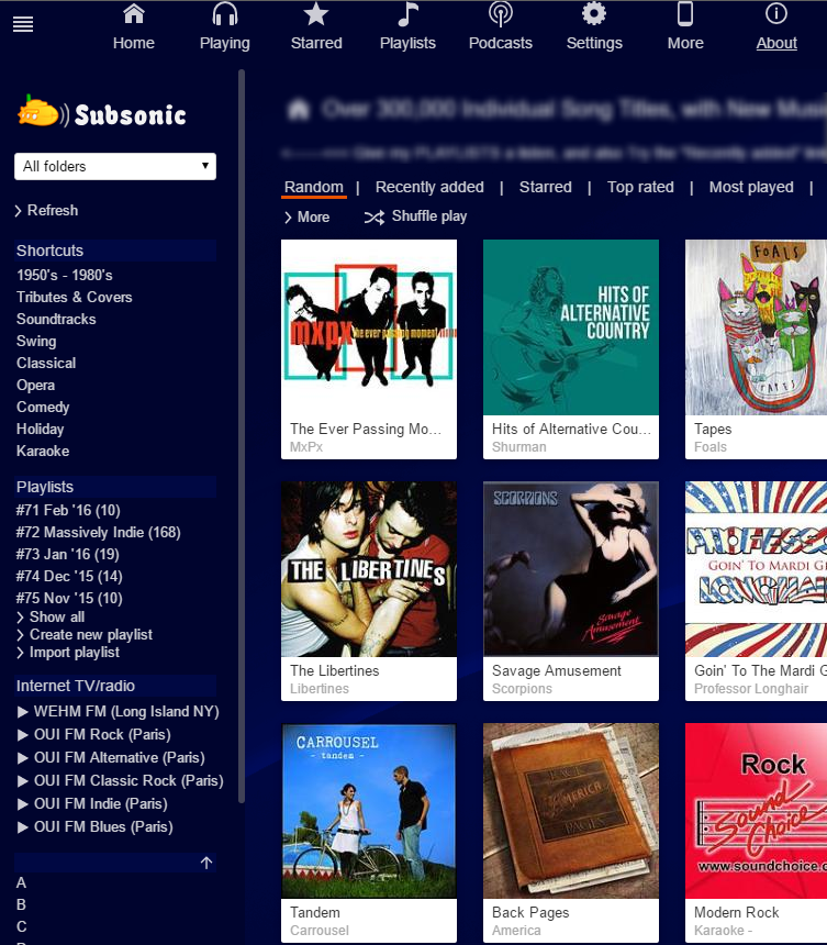
I realize many people do not use Shortcuts, but smart use of them adds considerable access to areas that many users might simply overlook if buried in a drop-down box.
Image
It may look cluttered to some, but if the goal is to provide a user with a wider selection than the Home screen... It works well
Image
dirkal
 
Posts: 13
Joined: Sat Nov 05, 2011 8:20 pm

Re: Subsonic 6.0.beta2 released

Postby acroyear » Fri Apr 01, 2016 2:11 am

In the end I'm not that that heavily attached to the web UI either way, as my primary UI is my own app, SubFire, which I built to run on multiple platforms. The Web UI is, for me, just the point of fixing album covers and tweaking ID3 values, plus a little playlist management (and I'm writing my own smart-playlist "radio" generator that's actually going to take over that aspect more and more).

Perhaps it would be interesting to know just how many prefer apps over the web UI no matter what, simply because of where they use it. Indeed, I'm sure most of us who are app developers generally use the app we built, because it keeps us involved in the development and improvements. But that's the kind of demographic question that is hard to get clear data for, just like it can be hard to get a feel for how many use it for video vs just for music (I'm a music-only user - my video cloud is Plex).

Whether or not some of these UI changes are 'right' might also depend on the organization of your collection. I have 2 servers. One has a LOT of very shallow folders (the rock, celt, folk, and kids/disney set - one folder is JUST my 'King Crimson' related collection). The other has only a few folders but they are very deep, as the classical folder is divided up by era, then composer, then works divided up by conductor. What you use the shortcuts for, I use entire separate MusicFolders for instead, based on your screenshots.

[this, btw, means that one one of my setups, having the Index page use pseudo-tabs for the top-level music folders is useless because 3/4ths of them don't even show up, while the other works just fine and I can clearly see the select-option tool being annoying outside of the left sidebar.]

In both, the shortcuts (for example) mean nothing - in the first case, being 'shallow', I can get to what I want within a few clicks; in the second case, since shortcuts seem to only work for the folders under the 'indexes', they're of no use at all to getting to, say, my fav composers. They really do mean nothing to me. I didn't even know they existed 'til someone complained about it during the b1. I just don't need them, so I don't care either way. For internet radio, I had very little use of it on the Web UI, because being just the raw stream, it didn't give me the updates of track, cover art, etc, that the dedicated clients of the radio servers themselves (radionomy, etc) give; anybody else like that would not have even noticed that the radio page wasn't even accessible in b1 :) .

To be honest there are a LOT of features, and a lot of different ways to do things. Anything Sindre does is either going to complicate it more for someone who doesn't use or need a feature, or simplify it but necessarily remove a feature or access path someone really liked. This is true for any aging stable and successful product.

In the end, any UI needs to make all things possible and the most common tasks easy. The index being its own top-level page meant that the left side had little use as being somewhat redundant. The oversight was that the "common task" is that users switch gears (in effect, change stations) often, and rapidly. If you just want to dig down to the album or playlist, hit play, and let it go, the empty left-side was just fine. Hide it except when you need it for those rare tasks (settings, logout). It seemed to me a valid reason, a valid "user story", to justify the limited content within it. I was fine with it that way, myself, but as I said, my primary use case for the WebUI is not necessarily to play music.

But obviously many here aren't like that: they seem to want to be able to switch from one to another to another without all the work of going back to the top-level index to do it, especially if, perhaps, they're having trouble deciding what they want. (reasons I won't ever use spotify: too many choices...)

So now, in this b2, we're kinda in a hybrid case there, trying to provide the index for those of that latter group, but now it is the only home for those other 4 options and they have to remain accessible. Maybe they'd be better at the bottom than the top of the left? Not sure. For the most part, b2 was more work behind-the-scenes, especially on the video transcoding. The left-side index I see as a work-in-progress (this is why we call 'em 'beta') for feedback, of which yours is I believe valid. I think if you want to know what he had in mind in the UI originally, look at b1: each feature accessed by top-level "tab", and the sidebar only being there for those rarely used features to get them off of the main navigation page.

But that's just a guess. For myself, as a developer, I'm more interested in API improvements. :twisted:

Joe
--
Joe Shelby
http://subfiresuite.com/
http://subfireplayer.net/
User avatar
acroyear
 
Posts: 777
Joined: Wed Mar 27, 2013 8:05 pm
Location: Northern, VA

Re: Subsonic 6.0.beta2 released

Postby Trufax » Fri Apr 01, 2016 10:48 pm

Thank for the new Release work great so far.

I have a suggestion for the sidebar UI, see attached picture. I also think the internet radio feature should move to the top.

Image
Trufax
 
Posts: 21
Joined: Tue Dec 06, 2011 8:32 pm

Re: Subsonic 6.0.beta2 released

Postby acroyear » Sat Apr 02, 2016 12:41 am

An icons only approach? (with, I presume, hover-tooltips to show the text but eventually muscle-memory will do the rest)

I actually kinda like it. Maybe have it have the full text of the links, as it is in b1, if the user has left-index turned off.
--
Joe Shelby
http://subfiresuite.com/
http://subfireplayer.net/
User avatar
acroyear
 
Posts: 777
Joined: Wed Mar 27, 2013 8:05 pm
Location: Northern, VA

Re: Subsonic 6.0.beta2 released

Postby deejay2302 » Sat Apr 02, 2016 9:27 pm

Another bug. The radio station urls does not work. :-/ Ever the same message: Not supported file format! Does not work with any ip adresse or http link or listen.pls. Pls fix
21.681 Artists
58.141 Albums
674.091 Songs
5072,14 GB (~ 49.341 Hours)
User avatar
deejay2302
 
Posts: 165
Joined: Tue Oct 06, 2009 5:36 pm
Location: Germany

Re: Subsonic 6.0.beta2 released

Postby insann » Sat Apr 02, 2016 9:59 pm

deejay2302 wrote:Another bug. The radio station urls does not work. :-/ Ever the same message: Not supported file format! Does not work with any ip adresse or http link or listen.pls. Pls fix


I think its due to html5 player and AAC streams ! firefox can't read them ! ( maybe need to go trough transcode before ?)

Insann
insann
 
Posts: 39
Joined: Sat Nov 14, 2015 6:37 pm

Re: Subsonic 6.0.beta2 released

Postby acroyear » Sat Apr 02, 2016 10:55 pm

Sometimes it is more a matter of setting the right mime/type on the html5 audio tag. If you tell the tag that the file is mp3 and then send it aac, it may barf at that. Other browsers may choose to ignore the mimetype set by the code if it can recognize the file format. (note: the code has to tell the audio tag that: you personally can't do anything unless you're hacking the source code...).

That said, the one station I have, Muppet Central Radio, hosted by radionomy (since Live365 vanished), is working fine, both Chrome and Firefox, on Android and OSX for me. I guess it is streaming mp3 format...

Joe
--
Joe Shelby
http://subfiresuite.com/
http://subfireplayer.net/
User avatar
acroyear
 
Posts: 777
Joined: Wed Mar 27, 2013 8:05 pm
Location: Northern, VA

Re: Subsonic 6.0.beta2 released

Postby Jägs » Sun Apr 03, 2016 1:14 am

With the new Last.fm album art, um, fetcher--for lack of a better word--is there a way to show the resolution of each of the results? That, or would it be possible to preview it at full resolution prior to selection?

Either case would allow the selection of the best resolution out of the results.
Jägs
 
Posts: 109
Joined: Wed Apr 06, 2011 9:52 pm

Re: Subsonic 6.0.beta2 released

Postby Optira » Sun Apr 03, 2016 11:45 am

I've a problem to browse the library with my Sonos-app (Android) and Windows client. It's very very slow respectively the app want's to quit because the app isn't responding anymore. I think it has something to do with the new feature that now the "artist-picture" are shown as icon (from last-fm?)

Furthermore the behavior that the queue pops up when I hover over is very annoying (eg. when I go down with the cursor to the Windows taskbar) - quite often I've also problems to collapse the queue again.

Subsonic runs on an Raspberry Pi 2
Optira
 
Posts: 12
Joined: Tue Aug 18, 2015 9:05 pm

Re: Subsonic 6.0.beta2 released

Postby Skywatcher » Sun Apr 03, 2016 12:34 pm

Optira wrote:Furthermore the behavior that the queue pops up when I hover over is very annoying (eg. when I go down with the cursor to the Windows taskbar) - quite often I've also problems to collapse the queue again.

Subsonic runs on an Raspberry Pi 2


Settings -> Personal -> Auto-Expand Play Queue (untick)
Skywatcher
 
Posts: 41
Joined: Tue Feb 16, 2010 7:08 am

Re: Subsonic 6.0.beta2 released

Postby Optira » Sun Apr 03, 2016 8:06 pm

Thank you very much - searched for this option but missed it...
Optira
 
Posts: 12
Joined: Tue Aug 18, 2015 9:05 pm

Re: Subsonic 6.0.beta2 released

Postby sindre_mehus » Sun Apr 03, 2016 8:41 pm

I'm working on improving the embedded internet radio player. I hope to make it work with m3u, pls and xspf playlists - as well as raw audio streams in most formats (it'll use ffmpeg to convert to mp3 internally).

So far it's working with every stream I have tried, but can you please send me some URLs to test with?

Thank you!
Sindre
Subsonic developer
User avatar
sindre_mehus
 
Posts: 1955
Joined: Tue Nov 29, 2005 6:19 pm
Location: Oslo, Norway

Re: Subsonic 6.0.beta2 released

Postby acroyear » Sun Apr 03, 2016 9:01 pm

sindre_mehus wrote:I'm working on improving the embedded internet radio player. I hope to make it work with m3u, pls and xspf playlists - as well as raw audio streams in most formats (it'll use ffmpeg to convert to mp3 internally). So far it's working with every stream I have tried, but can you please send me some URLs to test with?


http://streaming.radionomy.com/MuppetCentralRadio - this one has never had a problem, but for backwards compatibility sake, rather not have MY fav station break while fixing the others. 8)
--
Joe Shelby
http://subfiresuite.com/
http://subfireplayer.net/
User avatar
acroyear
 
Posts: 777
Joined: Wed Mar 27, 2013 8:05 pm
Location: Northern, VA

Re: Subsonic 6.0.beta2 released

Postby nildin » Mon Apr 04, 2016 11:34 am

I know that this is not a "6.0" bug as this never worked before, but I thought maybe it would be nice to get it to work (if possible) as 6.0 comes with a big video update.

It would be awesome if videos in playlists start playing hitting the playbutton in the playlist.
nildin
 
Posts: 10
Joined: Thu Nov 28, 2013 10:07 am

Re: Subsonic 6.0.beta2 released

Postby Neil Hunt » Mon Apr 04, 2016 8:08 pm

sindre_mehus wrote:I'm working on improving the embedded internet radio player. I hope to make it work with m3u, pls and xspf playlists - as well as raw audio streams in most formats (it'll use ffmpeg to convert to mp3 internally).

So far it's working with every stream I have tried, but can you please send me some URLs to test with?

Thank you!
Sindre


http://s5.streammonster.com/tunein.php/ ... aylist.pls
Neil Hunt
 
Posts: 13
Joined: Thu May 24, 2012 7:57 pm

PreviousNext

Return to Announcements

Who is online

Users browsing this forum: No registered users and 12 guests